
Back to White Walls: Why I’m Repainting the Trunk Room
and how to pick the perfect white paint color...
*Some of the links in this post are affiliate links, which means I may receive a small commission if you make a purchase — at no extra cost to you.
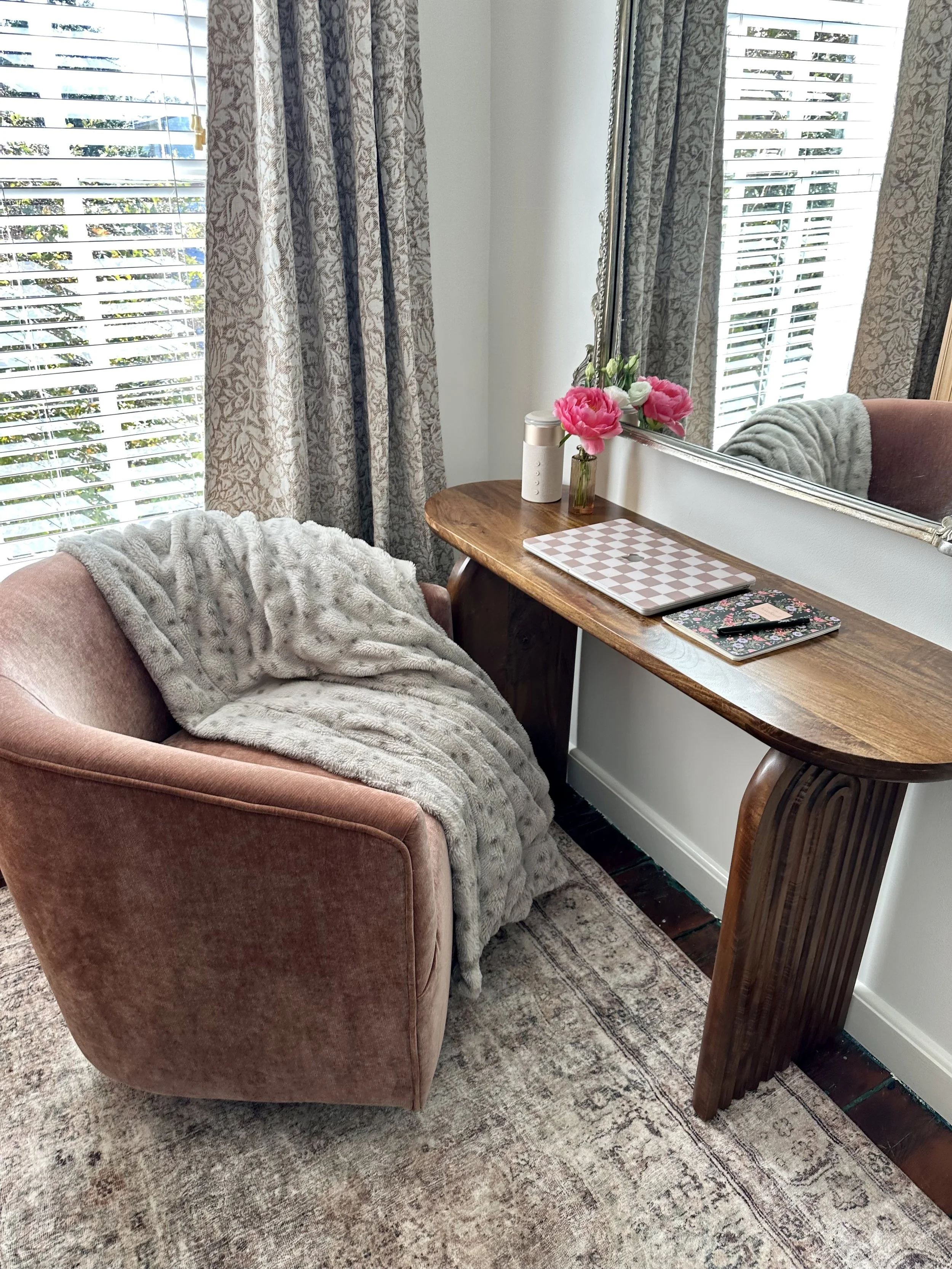
Earlier this year, we painted our trunk room in Benjamin Moore Cinnamon Slate. If you’re not familiar, a trunk room is one of those charming, quirky little spaces in older homes. They are typically small, windowless rooms tucked off a main bedroom (thankfully, ours does have a window). They were originally used for storing steamer trunks during travel seasons in the late 1800s, but we use ours as a home office.
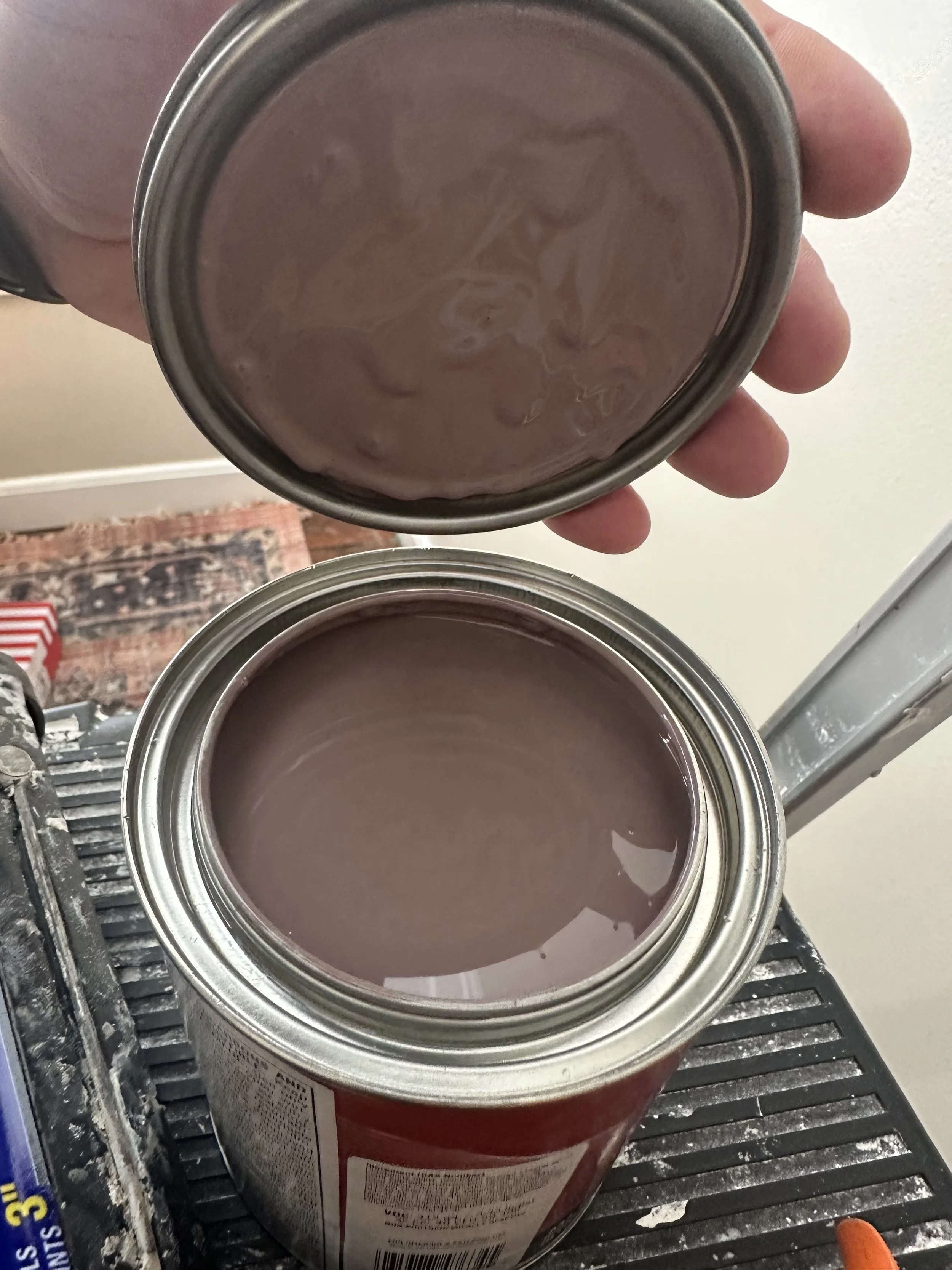
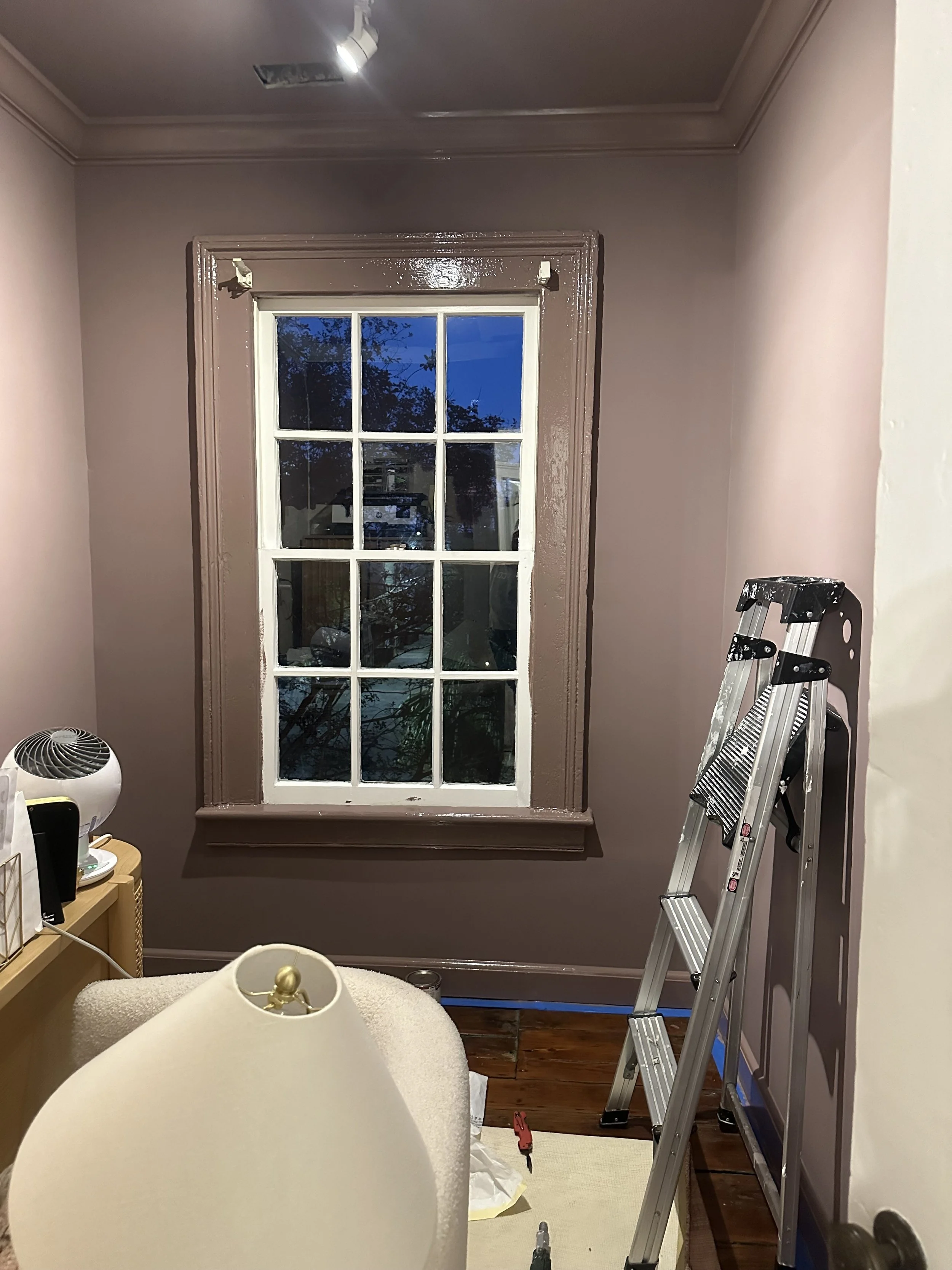
I went all in with a full color drench— walls, ceiling, and trim all in that rich, moody purple. I wanted it to feel cozy, dramatic, and inspiring. And it did... at first. But over time, the room started to feel more like a cave than a creative, productive work space. What I hoped would be a favorite spot quickly became a space I avoided any chance I got.
Thankfully I have a very understanding husband, who is always supportive of my need to find the perfect paint color. The truth is, I need this room to feel bright and welcoming and this color was far from that.
I’m a firm believer that it’s okay to try something bold and realize it’s not the vibe you were going for. Paint is one of the most affordable ways to change a space and sometimes, it takes a second try to get it right. Trust me, there is no shame in a paint re-do and this room really needed one.
This room become a catch all and I have been reimagining it as a multi-purpose room. I want it to function again as a home office, but also partly as a mini home gym. I decided to move our Peloton bike out of our bedroom, and the trunk room is where it landed. I have been wanting this room to feel brighter, lighter, and way more inviting, so that I actually want to spend time in here.
That means, we’re going back to white.
But here’s the tricky part: white paint is never just white.
If you have ever searched for the perfect shade of white paint, you know it isn’t as easy as it sounds. If you’ve ever stood in front of a wall of swatches wondering how there can be 147 variations of “white,” I see you.
Here’s what I’ve learned:
Warm whites can bring a cozy, inviting feel but tend to pull yellow—especially in south-facing rooms or spaces with lots of warm-toned furniture.
Cool whites feel fresh and crisp, but in rooms with low natural light, they can come across sterile, grey, or even a bit blue.
Lighting changes everything. The same paint can look totally different in morning light vs. afternoon shadows vs. overhead bulbs. Always test a few samples at different times of day!
I’m typically a loyal fan of Benjamin Moore Chantilly Lace. It has never failed me, but I’m ready to shake things up a bit. I am on the hunt for something that feels a little more calm and inviting. Choosing a white paint color can be a personal preference, too. I avoid shades that pull even a tiny bit of yellow. Yellow whites have never been for me, but finding one that isn’t too cool is equally difficult. When they are too cool, they can pull blue and feel a little more like a hospital.
I rounded up a few colors that I think would be perfect!
My white‑paint sample lineup includes:
Farrow & Ball - Wevet: airy and subtle with a hint of grey
Farrow & Ball - All White: their version of pure white, no undertone
Benjamin Moore - White Dove: a classic soft white with warmth
Sherwin‑Williams - Pure White: a neutral white with just enough depth
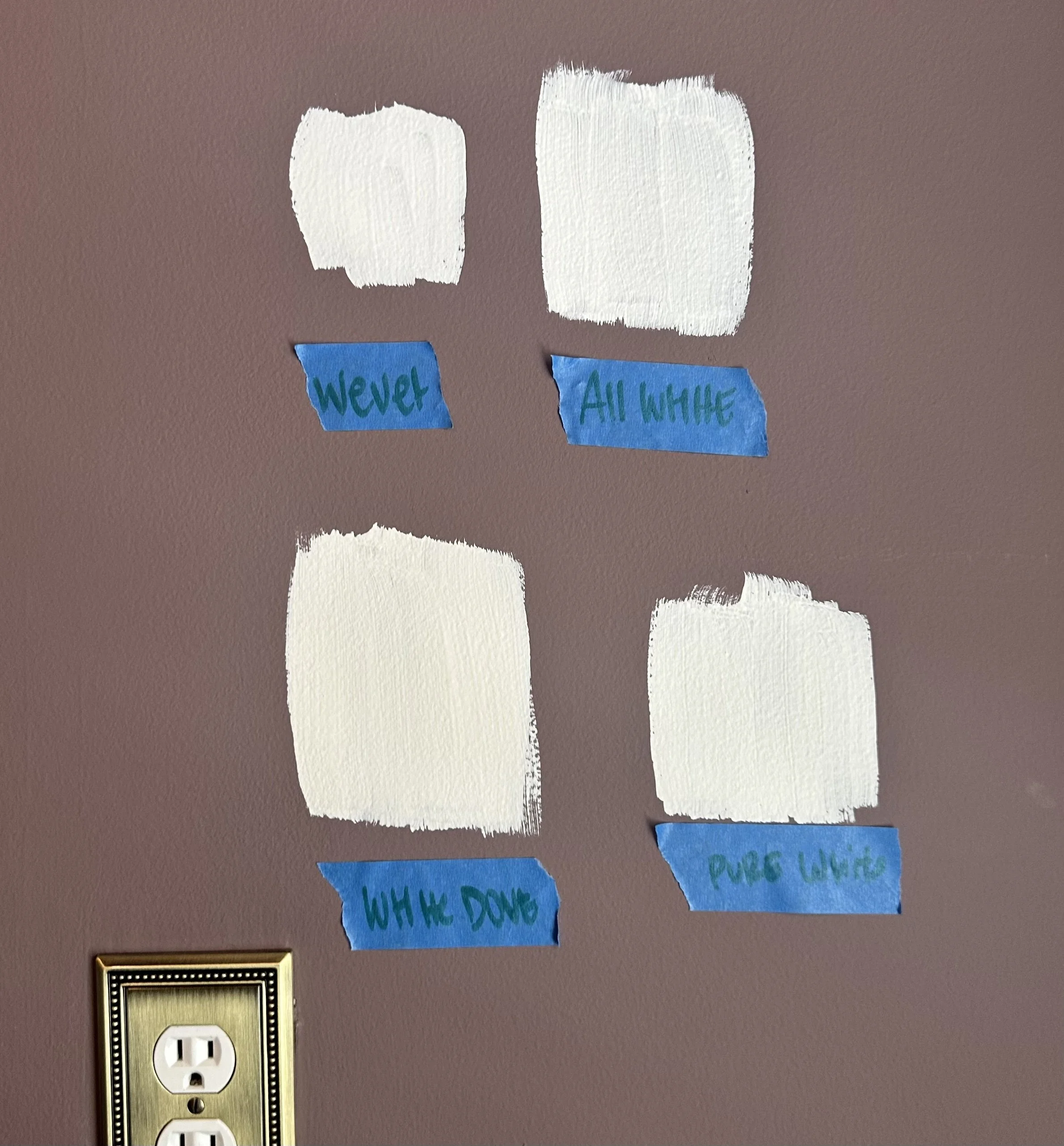
I was really happy with this collection of samples. This room captures a good amount of natural light but only at certain times of day, so the color really needs to hold up in both warm daylight and lamplight at night. Sometimes it takes me a few rounds, but pretty quickly we decided on— Benjamin Moore White Dove. I was a little worried it may pull too much yellow, but knowing I wanted a cozy white, it felt like the perfect choice.
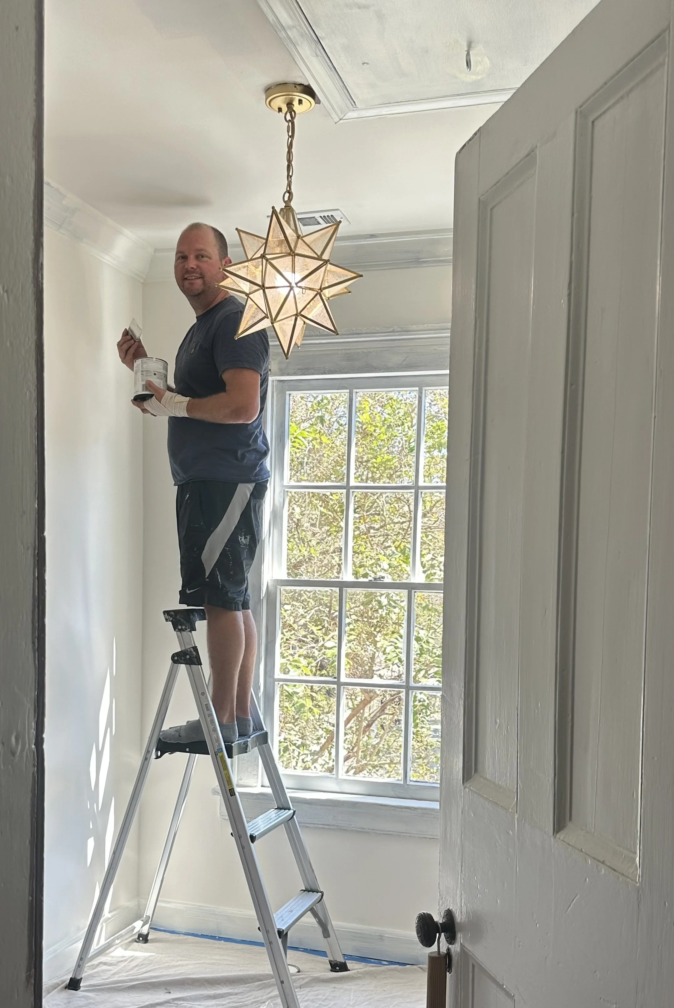
We quickly realized that this was going to require a lot paint to cover, but it instantly made the room feel bigger and brighter.
Lee is truly the MVP…my most valuable painter! I truly could not be happier with the way this color brightened the room and kept a sophisticated, cozy feel.
This whole project has been a great reminder: it’s okay to try something and not love it. Design is meant to evolve. Paint isn’t permanent. Mood boards can shift. And sometimes what feels inspiring in theory doesn’t always work in reality—and that’s okay. You can always pivot. You can always repaint.
So here we are: back to white, one that fits this new season, a new use of the room, and the peaceful, practical energy I’m craving in this space. Stay tuned for the full reveal!
Drop your ride-or-die white paint colors in the comments—I’d love to hear your favorites!